Your Google Analytics Reporting Template Guide

A solid Google Analytics reporting template is basically a pre-built dashboard that pulls and visualizes your data automatically. Think of it as a magical robot that saves you from spreadsheet purgatory. It’s designed to lay out your key performance indicators (KPIs) in a way that’s clean, consistent, and actually tells you something useful. It's about turning that mountain of raw data into a story you can actually understand.
Escape the Manual Reporting Nightmare
Let's be real. Manually exporting Google Analytics data, wrestling with VLOOKUPs, and trying to make a spreadsheet look even remotely professional is a unique form of torture. It’s tedious, ridiculously prone to human error, and a massive waste of your precious time and talent.
If you’ve ever lost a Monday morning just copying and pasting rows of data, you know this pain on a spiritual level.
This is your official intervention. A good Google Analytics reporting template isn’t just some nice-to-have gadget; it’s your get-out-of-spreadsheet-jail-free card. It’s about taking back your time to focus on brilliant strategy, not being a data entry clerk.
With the big switch to Google Analytics 4 (GA4), having a standardized report is more crucial than ever. The new data model is powerful, sure, but it can also feel like learning Klingon. A well-built template is your universal translator, making sure you pull the right metrics, in the right way, every single time. That consistency is a total game-changer, especially for agencies juggling multiple clients. No more second-guessing if you used 'Users' or 'Active Users' in last month's report.
Key Takeaway: The whole point of a template is to make the process of reporting so seamless it becomes an afterthought. Your energy should go into analyzing the story the data is telling, not into the painful process of building the book.
Why You Need a Reporting Template Right Now
You might be thinking, "It only takes me a few hours, what's the big deal?" But those hours add up fast. The leap from manual to automated reporting is bigger than you think.
Industry analysis shows that teams using standardized templates can slash their report generation time from 4-6 hours of soul-crushing manual work down to just a few minutes. That's a huge shift, freeing up your team to focus on actual analysis instead of just gathering data. You can learn more about the real-world impact of automated reporting on Dashthis.com.
To put it in perspective, let’s look at the before and after.
| Pain Point | Template Solution | Impact |
|---|---|---|
| Hours spent on copy-pasting data every week/month. | Automated data pulls directly from GA. | Time is freed up for high-value strategic analysis. |
| Reports are inconsistent across different clients or periods. | Standardized metrics and visuals for every report. | Builds trust with stakeholders and makes trends easier to spot. |
| Simple human error leads to inaccurate data. | Direct API connection eliminates manual data entry. | Confidence in your numbers and more reliable decision-making. |
| Reports look bland and are hard for clients to understand. | Professional, pre-designed visualizations. | Data is easier to digest, leading to better insights and happier clients. |
This isn't just about saving a bit of time. It's a fundamental change in your workflow that lets you deliver way more value. Instead of getting bogged down in repetitive tasks, you can finally dig into the "why" behind the numbers.
Here’s a quick breakdown of what you really gain:
- Guaranteed Consistency: Every report, for every client, looks and feels the same. It uses the same metrics and the same logic, which builds trust and makes it way easier to spot trends over time.
- Drastically Reduced Errors: Those embarrassing copy-paste mistakes? Poof. Gone. Automation pulls data directly from the source, so you can trust what you're seeing.
- More Time for Analysis: This is the big one. When you aren't drained by the grunt work, you have the mental space to actually interpret the data, find hidden opportunities, and make recommendations that drive real growth.
Think of it as finally breaking up with your spreadsheet addiction. It’s time to let the machines handle the boring stuff so you can get back to doing what you do best.
Choosing Metrics That Actually Matter
Here’s a fun fact: a report that makes your social media manager do a happy dance might make your CEO’s eyes glaze over.
Why? Because they care about completely different things. The secret sauce to a killer Google Analytics reporting template is tailoring it to the person reading it.
Your goal is to deliver insights, not just a data dump. A report full of vanity metrics like sessions or pageviews without context is like telling someone you drove 500 miles without mentioning where you were going. Cool number, but what does it mean?
We need to move past the fluff and get to the good stuff—the metrics that actually tie back to business goals. It's about answering the "so what?" before it's even asked.
To help you get this right, let's ditch the theory and jump into a few real-world scenarios. We'll look at three distinct audiences and pinpoint the key performance indicators (KPIs) that will get you nods of approval instead of blank stares.
This concept map shows how a solid template framework leads to time savings, consistency, and ultimately, better business decisions.
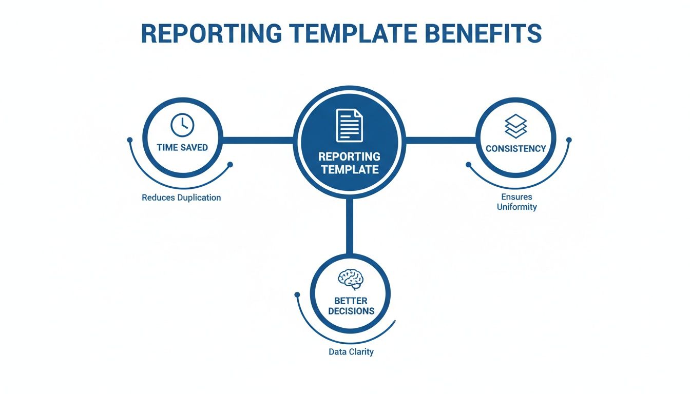
As you can see, using a template isn't just about efficiency; it's a strategic move that directly supports smarter, data-driven growth.
For the Agency Client Obsessed with ROI
Agency clients have one question on their mind, always: "Is this making me money?"
Your report needs to answer that question, loud and clear. They couldn't care less about bounce rates if sales are up.
So, what should you focus on?
- Cost Per Acquisition (CPA): This is the holy grail. How much are you spending to get one new customer? Connect your ad spend to your conversion data to show exactly what a new lead or sale costs from each channel.
- Return On Ad Spend (ROAS): For every dollar they give you for ads, how many dollars are coming back? A ROAS of 4:1 sounds a lot better than "we got 10,000 clicks."
- Assisted Conversions: This is your secret weapon. It shows how channels that didn't get the last click still played a crucial role in the customer's journey. It proves the value of top-of-funnel activities, like that blog post that introduced a customer to the brand weeks before they finally bought something.
- Conversion Rate by Channel: Which channels are actually pulling their weight? Showing that organic search has a 5% conversion rate while paid social has a 1% conversion rate provides immediate, actionable insight into where the budget should go.
Don’t just show the numbers; tell the story. For example: "Our SEO efforts this quarter not only drove 50 direct sales ($5,000 in revenue) but also assisted in 120 other sales ($12,000 in revenue), proving its value beyond last-click attribution."
For the E-commerce Store Owner
E-commerce managers live and breathe the customer journey. They're obsessed with every step, from the first click to the final "thank you for your order" page. Your report needs to reflect that obsession.
With GA4 now the standard, e-commerce reporting templates have leveled up. They support advanced metrics like e-commerce conversion rates, transaction values, revenue tracking, average purchase revenue, and unique purchase quantities—all of which are gold for an online store owner.
Key metrics to include:
- Shopping Cart Abandonment Rate: This is a huge one. Statista reports the average is nearly 70%, so a high rate could signal issues with shipping costs, a clunky checkout process, or unexpected fees.
- Average Order Value (AOV): Are customers buying more per transaction? This metric helps you understand if your upselling and cross-selling tactics are working.
- Customer Lifetime Value (CLV): How much is a customer worth over their entire relationship with the store? This helps shift focus from one-time sales to building long-term loyalty.
- Top Performing Products: Which products are flying off the virtual shelves? This data can inform inventory decisions, marketing campaigns, and even future product development.
For the SaaS Company Focused on Growth
For a Software-as-a-Service (SaaS) business, it's all about acquisition and retention. Getting a user to sign up is only half the battle; keeping them is what really matters.
Your Google Analytics reporting template needs to track the entire user lifecycle.
- User Churn Rate: How many customers are canceling their subscriptions each month? This is the ultimate health metric for a subscription business. While GA might not track this directly, you can integrate it with your billing data.
- Trial-to-Paid Conversion Rate: Of all the people who sign up for a free trial, how many become paying customers? This tells you how effective your onboarding and product are at demonstrating value.
- Lead-to-Customer Rate: What percentage of your leads (e.g., demo requests, content downloads) eventually convert? This helps you gauge the quality of your marketing-qualified leads (MQLs).
- User Engagement Metrics: Are users actually using the product? Track key events within your app to see if users are adopting a new feature or completing important workflows. Low engagement is often a leading indicator of churn.
Ultimately, choosing the right KPIs is about empathy. You need to understand what your audience values and what keeps them up at night. For more ideas on this, check out our guide on how to choose KPIs for client reporting.
Building Your First Reporting Template
Alright, enough theory. It's time to roll up our sleeves and actually build something. A great Google analytics reporting template doesn't just present data; it tells a story. And like any good story, it needs a clear beginning, middle, and end.
The goal here is to create a structure that guides your reader from a high-level overview down to the nitty-gritty details. We're turning abstract data points into a compelling narrative that even your least data-savvy stakeholder can follow. This isn't just a report; it's an asset that pays you back in saved time every single week.
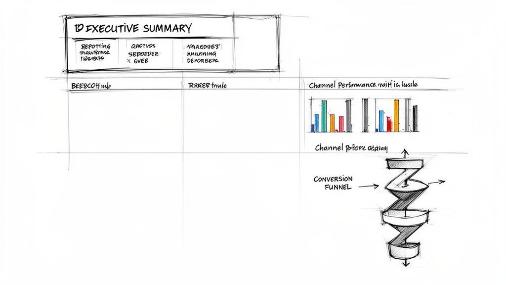
Start with the Executive Summary
Every single report should begin with the punchline. This is your one shot to answer the big "So what?" question before anyone even has a chance to ask it. The executive summary is where you boil down the most important findings and your key recommendations into plain English.
Think of it as the TL;DR for busy executives. A study by the Nielsen Norman Group found that users often read only 28% of the words on a web page, so putting the most critical info first isn't just a good idea—it's essential.
Keep it to a few bullet points that immediately tell the reader if things are going great, terribly, or somewhere in between.
For example:
- Overall Performance: Website traffic is up 15% month-over-month, mostly thanks to a killer organic search campaign that boosted new user acquisition by 22%.
- Key Win: The new landing page for our "Pro Plan" is converting at 7%, which is double the site average.
- Area for Improvement: Paid social campaigns saw a 30% spike in cost-per-acquisition. I recommend we reallocate that budget to our top-performing search ads.
This immediately sets the stage and gives context for all the charts and graphs that follow.
Visualize Channel Performance
Next, you have to show how you got those results. This section is all about breaking down performance by traffic source. Forget boring tables of numbers; this is where visuals come in to save the day. A well-designed chart can communicate trends far more effectively than a spreadsheet ever could.
Simple is always better. Stick to clean bar charts and line graphs that are easy to understand at a glance.
Your goal here is to answer questions like:
- Which channels are driving the most traffic?
- Which ones are bringing in the most valuable users (i.e., people who convert)?
- Are there any channels that are suddenly tanking?
A simple bar chart comparing Users by Channel for this month versus last month can instantly highlight which marketing efforts are paying off and which ones are duds.
Dive into Audience and User Behavior
Now that your stakeholders know where traffic is coming from, it's time to show them who these people are and what they're doing on the site. This is where you move beyond simple traffic metrics and start getting into real engagement.
The core of good analysis is understanding human behavior. Your GA4 report should be a window into what your audience wants, what confuses them, and what convinces them to act.
This section can include things like:
- Top Landing Pages: Which pages are the main front doors to your site? This helps you understand what content is really resonating.
- User Demographics: A simple breakdown of users by age, gender, and location can help verify if you're actually reaching your target audience.
- Engagement Rate: In GA4, Engagement Rate has replaced Bounce Rate. It shows the percentage of sessions that lasted longer than 10 seconds, had a conversion event, or had at least 2 pageviews. It’s a much better indicator of whether your content is actually holding anyone's attention.
To get some fresh ideas and make sure you're using best practices, it's always a good idea to check out different management reporting template resources. Seeing how others structure their reports can spark some great inspiration.
Map Out the Conversion Funnel
Finally, you need to connect all this activity to the ultimate goal: conversions. Whether a "conversion" is a sale, a lead form submission, or a free trial signup, this section shows how users are moving toward that goal.
In GA4, you can build custom funnel exploration reports to visualize this journey, which is incredibly powerful for spotting where people are dropping off. If you want to get really advanced, you can learn more about creating your own Google Analytics custom reports that are perfectly suited to your business.
For a standard report, you should include visuals that show:
- Total Conversions: The big number. How many times did users complete the desired action?
- Conversion Rate: What percentage of users converted?
- Funnel Visualization: A simple graphic showing how many users started checkout, how many entered shipping info, and how many completed the purchase. This can immediately pinpoint where your sales process is leaking money.
Putting Your Reports On Autopilot
Building a killer Google Analytics reporting template is a huge win. But if you're still manually exporting and emailing it out every week or month, you've only solved half the problem. Now it's time for the real magic: putting the whole thing on autopilot so you can finally get your weekends back.
Let's be honest, nobody enjoys being a glorified email reminder. Setting up automated delivery means your clients, your boss, and your team get their data fix on schedule, every single time, without you having to lift a finger. This isn't just about saving a few hours; it’s about creating a reliable, professional system that runs itself.
Think of it like setting your reporting on cruise control. You've already built the perfect vehicle (your template), and now you're letting technology handle the driving. The result? Consistent, timely data that keeps everyone in the loop and makes you look like an absolute pro.
Schedule Your Reports Like Clockwork
The most direct path to automation is scheduling reports to be sent by email. Most reporting tools worth their salt—including GA4's native sharing features and third-party platforms—let you set up recurring deliveries. You can choose the frequency—daily, weekly, monthly—and the exact time they land in someone's inbox.
This consistency is a bigger deal than it sounds. When stakeholders know to expect their performance update at 9 AM every Monday, it becomes a trusted part of their routine. They're far more likely to actually read it and act on the insights because it’s predictable.
Here's how I usually think about scheduling for different audiences:
- For C-level Execs: A monthly or bi-weekly high-level summary is typically all they need. They don't want the daily noise, just the big picture.
- For Marketing Managers: A weekly report often hits the sweet spot. It provides enough data to spot trends and make tactical adjustments without causing information overload.
- For Hands-on Practitioners (like you!): A daily dashboard or a weekly deep-dive report is perfect for staying on top of performance and catching any weirdness before it blows up.
The Agency Game Changer: White-Labeling
If you're running an agency, this next part is a total game-changer. Automation is great, but sending a report that looks like it came straight from Google is a massive missed opportunity. This is where white-labeling comes in.
White-labeling lets you strip all the generic, third-party branding from your reports and replace it with your own. You can slap your logo on it, customize the colors to match your brand, and instantly, a standard data export becomes a premium, polished deliverable.
This simple step is what separates the amateurs from the pros. It transforms a basic data update into a professional service that screams, "We know what we're doing, and you're in good hands."
It reinforces your brand's value every single time you send a report. Clients aren't just getting data; they're getting your analysis, presented in your professional package. This small detail has a huge impact on client perception and retention. After all, a report with your logo on it just feels a lot more valuable than a standard PDF from Google.
For a deeper dive, our guide covers more on how to properly send Google Analytics marketing reports by email.
Connecting to Your Other Tools
True automation goes way beyond just sending an email. Your Google Analytics reporting template becomes infinitely more powerful when it can "talk" to the other tools you use every single day. Many reporting platforms offer integrations that can push data and notifications right where you need them.
Imagine this scenario: an e-commerce site's conversion rate suddenly tanks by 50%. Instead of you finding out in the next weekly report, an automated alert is sent directly to your team's Slack channel. Within minutes, you're aware of the problem and can start digging in. Research from HubSpot shows that integrating analytics with other marketing platforms is the key to getting a complete picture of performance.
Consider these powerful integrations:
- Slack or Microsoft Teams: Get key metric updates or critical alerts sent directly to your team's chat. This is perfect for real-time monitoring.
- Google Sheets: Automatically pipe raw data from your reports into a spreadsheet for more advanced, custom analysis or to feed other dashboards.
- Project Management Tools (like Asana or Trello): Automatically create tasks based on report findings. For example, if a landing page's engagement rate drops below a certain threshold, a task can be created for the content team to review it.
By plugging your reporting into your daily workflow, you turn static data into an active, automated system that helps your team make smarter decisions, faster. You’re no longer just reporting on the past; you’re proactively shaping the future.
How to Handle Common Data Disasters
We’ve all been there. You open a report, take a sip of coffee, and promptly spit it out. Traffic has dropped 90%, or your conversions have flatlined to zero. It’s a moment of pure, unadulterated panic.
But here's the thing: data glitches happen. It's a fact of life in the analytics world. A tracking code breaks, a UTM parameter gets mangled, or a filter goes rogue. This section is your emergency guide for troubleshooting the most common GA headaches, turning you from a panicked mess into a cool-headed data detective.

The Mystery of '(not set)'
Seeing '(not set)' pop up in your reports is like finding a sock in your kitchen—you know it doesn't belong, but you have no idea how it got there. This pesky value is just a placeholder Google Analytics uses when it’s missing a piece of information.
Most often, you'll see it crop up in your traffic source reports. This usually means that some of your campaign URLs are missing their UTM parameters (utm_source, utm_medium, utm_campaign). It's a classic sign that someone on your team probably shared a link without properly tagging it first.
Here’s your quick diagnostic checklist to hunt down the source:
- Audit Your Campaigns: First, check all your active ad campaigns and recent email blasts. Are all the links properly tagged? No exceptions.
- Look for Auto-tagging Issues: If you’re running Google Ads, make sure auto-tagging is enabled and correctly linked to your GA4 property. A broken link here is a super common culprit.
- Check for Redirects: Sometimes, redirects can strip UTM parameters clean off a URL. Run your tagged links through a redirect checker to see if the parameters are making it all the way to the final destination.
Why Google Ads and Analytics Don't Match
Another classic head-scratcher: your Google Ads account proudly reports 100 clicks, but Google Analytics only shows 80 sessions from that same campaign. It feels like someone is stealing your data, but the explanation is usually much simpler.
First, you have to remember that clicks and sessions are not the same thing. A user can click an ad multiple times, but that might only result in one session. A Microsoft study found that nearly 20% of users will click the same search result multiple times during a single task, which can easily inflate click counts over sessions.
Beyond that, here are a few other common reasons for the mismatch:
- Page Load Time: A user clicks your ad, but your landing page loads so slowly they bounce before the GA tracking code even has a chance to fire. Analytics never sees them, but Google Ads already happily counted the click.
- Tracking Code Errors: Is your GA4 tracking code installed correctly on every single landing page? A missing or broken snippet is a guaranteed way to lose data.
- Ad Blocker Interference: A significant percentage of users have ad blockers, and many of those block analytics scripts, too. The click gets recorded, but the session is completely invisible to GA.
Pro Tip: Don't aim for a perfect 1:1 match; it's a losing battle. Instead, look for major, sudden discrepancies. A difference of 10-20% is often normal, but if that gap suddenly widens to 50%, it’s time to put on your detective hat and investigate.
Proactive Problem Solving with Alerts
The best way to handle a data disaster is to catch it before it becomes a disaster. Waiting for your weekly Google Analytics reporting template to tell you there's a problem means you’ve already lost a week of accurate data.
This is where automated alerts completely change the game.
Instead of manually checking your stats every day, you can set up a system to notify you the moment something goes wrong. Platforms like MetricsWatch allow you to create custom alerts that keep an eye on your most important KPIs for you.
Imagine getting a Slack message that says, "Heads up! Your e-commerce conversion rate just dropped 75% in the last hour." That’s an immediate, actionable signal that something is broken—like a checkout button or payment processor—letting you fix it before you lose thousands in sales. This proactive approach turns your reporting from a reactive chore into a real-time monitoring powerhouse.
Your GA Reporting Questions Answered
Alright, you've got your templates built, your delivery automated, and you know how to handle a data hiccup without breaking a sweat. Still, a few nagging questions always seem to pop up when you're deep in the reporting trenches.
Let's knock out some of the most common ones with quick, no-fluff answers. Think of this as a rapid-fire round to clear up any lingering confusion.
Can I Use One Template for All My Clients?
Technically, you can. But you really shouldn't.
It’s tempting to create a single, one-size-fits-all Google Analytics reporting template, but it’s a bit like wearing the same outfit to a black-tie gala and a backyard BBQ. It just doesn't fit the occasion. A B2B SaaS company is laser-focused on trial-to-paid conversion rates, while an e-commerce client lives and dies by their cart abandonment stats.
Using the same template for both means you'll either overwhelm one with irrelevant data or leave the other completely in the dark.
My Advice: Build a solid base template with the universal stuff—traffic sources, user engagement, and the like. Then, for each client, duplicate that base and bolt on a custom "KPI" section that speaks directly to their business goals. It’s the perfect blend of efficiency and relevance.
How Granular Can I Get with My Data?
The answer is: surprisingly granular. Modern reporting tools can slice and dice your audience data in incredibly specific ways, letting you move way beyond "total traffic" and into understanding the people behind the numbers.
For instance, you can easily break down traffic by geographic location, device type, operating system, and even screen resolution. This gives you a crystal-clear picture of user behavior patterns. Attribution analysis has also come a long way, helping you pinpoint which social media platforms or search terms are driving your most valuable visitors.
This is the kind of detail that answers real business questions like, "Are our mobile visitors from California converting better than our desktop visitors from New York?"
Why Does My Data Look Different in GA4 vs. Universal Analytics?
Ah, the million-dollar question. If you’ve pulled reports from Universal Analytics (UA) and Google Analytics 4 (GA4) and set them side-by-side, you’ve probably noticed the numbers don't quite match. Don't panic; your data isn't broken.
The two platforms just measure things in fundamentally different ways.
- Sessions: UA would start a new session after 30 minutes of inactivity or at the stroke of midnight. GA4 ditched that midnight rule, so its session counts are often a bit lower.
- Users: UA tracked "Total Users," but GA4 shifted its focus to "Active Users." They're simply two different metrics measuring two different things.
- Conversions: In UA, a goal could only trigger one conversion per session. GA4, on the other hand, will happily count every single conversion event, even if the same one happens multiple times in a single visit.
If you're wondering how to get accurate data in the first place, nailing a proper GA4 integration is non-negotiable. A clean setup from day one prevents a ton of these confusing discrepancies down the road. The key is to stop trying to compare them 1:1 and start embracing the new, more flexible event-based model of GA4.
Ready to stop wrestling with reports and start getting real-time insights? MetricsWatch offers automated reporting and proactive alerts that catch data issues before they become disasters. Start your free trial today and see how simple analytics monitoring can be.
Article created using Outrank


