
7 Best Practices in Data Visualization for Marketing Reports
7 Best Practices in Data Visualization for Marketing Reports
7 Best Practices in Data Visualization for Marketing Reports
Marketers can include a lot of information in their reports. Customer demographics, conversion rates, website analytics, social media shares—the data can be overwhelming, not just for your team but for the stakeholders you share it with.
Complex data can be difficult for the human brain to process, but humans recognize images much faster than text. It’s helpful to display data in a visual format for a better understanding, with insights that improve decision-making. That’s where data visualization comes in.
In this post, we’ll look at some design best practices that will guarantee your data-driven stories are clear, engaging, and relevant.
7 best practices for marketing data visualization
Whether you create the visuals yourself with a data visualization tool or employ an expert, here are some elements you should bear in mind.
1. Set a clear goal and message
The first step in effective data visualization is to set a clear goal for what you want to achieve. Decide on the key message and determine the main story you want the data to convey and what you’d like your audience to take away from the visualization.
For example, if you’re a marketing agency and you’ve been running a series of Meta Ads on behalf of a client, you’ll want to create a campaign report that shows how well it’s working for them. You could do this by depicting an increase in clicks over the past 3 months.
Once you have a goal in mind, choose the most suitable type of visualization and decide which data to include. It’s important that your audience understands your objective from the start and that the data supports your core message (without manipulating the statistics).
2. Carefully consider your team’s resources
To make your data visualization meet your goals, and continue to reach them, consider your resources carefully. This will ensure that you have enough manpower and the right tools for current and future projects.
Assess whether you want to create the visuals in-house or hire a data visualization designer. Start by considering your business and marketing data visualization needs, who your primary audience is, and how frequently you’ll need new designs. This will give you a sense of the required work and whether it’s worth a longer-term investment.
If you’re a smaller operation, you might not have staff who are available to cover a new data visualization project. To make an informed decision, use time and expense management software for small businesses. This will show whether your teams have the time and resources to learn how to use new tools and begin creating designs.
Hiring a freelance, part-time, or full-time data visualization designer is another alternative. This can be a great solution to skills shortages in the team, or if you have more one-off projects and are unlikely to need frequent new designs for multiple clients with different objectives. On top of that, by hiring an expert, you’ll also be able to take advantage of their advice and ideas.
3. Know your audience
The goal of your visualization depends on the audience type, but your understanding of the audience also informs the style and message. Just like in marketing itself, you need to communicate with the right people in the right way. What’s the demographic? What is their level of knowledge?
If your stakeholders regularly handle facts and figures, it will be easier for them to untangle the data. But for those who are not familiar with charts and graphs, you’ll need to make the visualization as simple as you can. For example, a chart with an ascending trend line is more accessible than a table with an array of numbers.
Consider further questions the visualization may raise and be ready to answer them. Don’t forget to ask for feedback afterwards to find out how useful your audience found the report and what they’d like to see next time. Then, you can adjust the style and content of future visualizations.
4. Use quality data from your business management tools
You could design the most attractive visualization in the world, but it wouldn’t be useful if the data you used to create it was unreliable. It’s vital that you use accurate, up-to-date, complete, and relevant information from trustworthy, verified sources.
Of course, marketing teams and managers harvest data from multiple outlets and tools, from CRM systems to ERP solutions. Combined, they all provide key insights into your business, market, and audience.
Once you have all your data, collate it in one place to make it easy to find when you want to use it. You’ll also need to “clean” or refine the data, which means standardizing it into a consistent format and filtering out any inaccuracies, anomalies, or irrelevant information.
Leverage software reporting tools
Alternatively, if you’re a little low on time and resources, many business management solutions and software have great built-in reporting tools with their own visualizations. Using these features can be a great way to incorporate a variety of data sources without having to refine the data yourself.
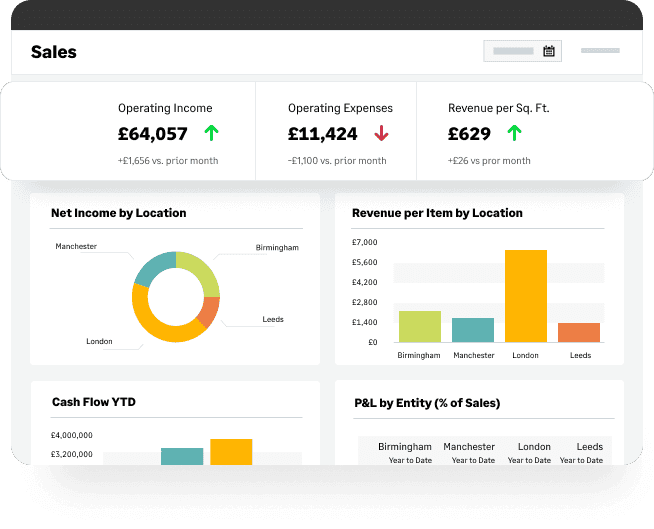
There are multiple great examples of this being effective. For instance, an ecommerce business could use its order management system software to provide deeper, more accurate insights into its marketing efforts, such as in their revenue per item per location report.
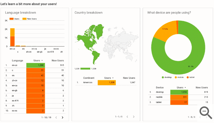
Other ways to find accurate and useful data include other data visualization studios. For example, SaaS businesses could use the templates provided by Google Analytics and Google’s Looker Studio, so their marketing reports will include insights into their global audience and justify which markets they want to expand into.
While this may mean you lose the uniformity of creating your own data visualizations, it can provide extra clarity. Each design will demonstrate the different themes and information sources and help provide natural breaks within your report.
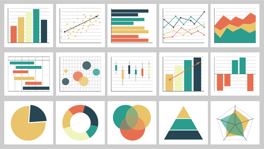
5. Choose the right visual format for your data
There are a number of visualization types to choose from, each with its own merits. You’ll need to pick a format that matches your data’s characteristics to clearly tell the story and highlight significant patterns and trends. Remember, you can use more than one type of visualization in your marketing reports.
Here are a few common types to choose from:
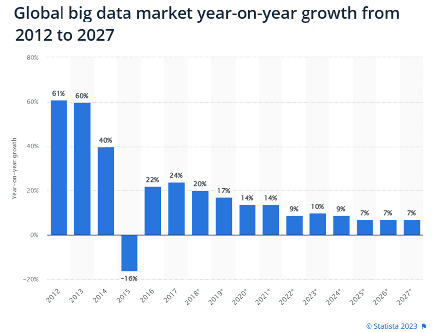
Column and bar charts: These are highly useful for data that can be split into multiple categories. You can then compare the quantitative data within a single measure and show the relationship between 2 variables.
Bullet charts: While similar to column and bar charts, bullet charts are marked with extra encodings to show progress towards a goal or performance against a reference line.
Line graphs: These help you compare values or performance over time, such as the success of a marketing campaign. You can also use them to compare changes in more than one data group.
Scatter plots: These visualization types are beneficial for exploring the relationships between 2 datasets by displaying values for 2 variables.
Pie charts: If you need to break down a dataset into different segments, such as percentages showing age groups who converted, pie charts are your best option. You might even use maps to visualize geographic data, such as regions where products sell best.
6. Provide context with labels and annotations
While data visualizations instantly make the information you’re presenting easier to understand, you can clarify things further by incorporating captions, labels, and annotations. Use them to highlight data points, trends, or anomalies, helping your audience to interpret the visualizations and draw the right conclusions about the data.
Labels can also explain how to read a chart. Be sure to include a legend that explains the color coding and label the axes of a graph. Alternatively, you can use captions that point out the difference between data points. You might also include additional information about any missing variables.
It’s a good idea to summarize the information beneath the chart itself—just a paragraph or 2 that assists with understanding the context. For example, describe the period being reported on and any relevant events, such as a factor that affected web traffic or sales.
When deciding on labels, be careful to avoid creating unhelpful bias. Too many annotations will clutter your visualization and distract or confuse the audience. Be mindful of your font choices too, as these will affect the legibility and accessibility of the text.
7. Be consistent with your colors and design
Color and design are crucial factors in making your visualization engaging and easy to interpret. It’s important to be consistent, so stick to the same design style and color palette across all visualizations.
If these are matched to your corporate color scheme, even better—it’ll give a professional look and help people recognize and remember your brand.
The best visual displays are clear and simple, using color to highlight and emphasize key information rather than just to make it look pretty. If you use too many colors, the charts will look chaotic and confusing, while a single color or a lack of contrasting shades can make the data blur into one.
Color association helps people to process information faster—such as using red for “heat” and blue for “cold”. Imagine your visualization shows sign-ups, you might use green to show peaks in subscriptions and red to show troughs. Brighter colors can denote key points, with gray for baseline data. You can highlight the most important bars on a bar chart to assist understanding.
Size also affects our visual perception and color choice, so try using larger shapes (or text in a word cloud) to show higher data values or significant marketing KPIs.
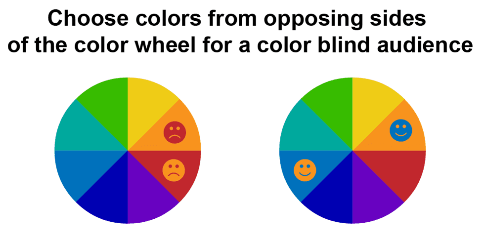
Whichever style you choose, the visualization format should make sense to your audience. For instance, when you’re communicating in a language that reads left to right, your charts and graphs need to follow that orientation. And remember to check how an image will be assessed by people with visual impairment, such as those who are color-blind, partially sighted, or legally blind, adding appropriate accessibility tools to be as inclusive as possible.
While it’s important to make visualizations attractive, be wary of prioritizing style over substance. Don’t overload the graphics with too much information or too many labels, and consider both legibility and adherence to your own branding.
By following these best practices in data visualization, you can help your audience make sense of the data and its core message.
Final thoughts
Data visualization is a fantastic way to simplify information in your marketing reports and make them more engaging. It helps the viewer understand facts and figures and identify patterns and trends over time. On top of this, they’re more likely to pull actionable insights from the data.
Whether it will be viewed by internal or external stakeholders, choosing the most clear and effective data visualization for the information will benefit the impact of the story you are telling and have the greatest effect on your audience.
David Appel - Global Head of SaaS

David Appel is Global Head of the SaaS Vertical for the largest technology company on the London Stock Exchange, Sage. Over time as a Sales and GTM leader, his organizations have earned the business of >2,000 SaaS and Software companies, growing at 40%+/year. He previously ran Direct Sales at Bill.com, led NetSuite’s Software Vertical, and was part of IBM’s Corporate Development team.
Marketers can include a lot of information in their reports. Customer demographics, conversion rates, website analytics, social media shares—the data can be overwhelming, not just for your team but for the stakeholders you share it with.
Complex data can be difficult for the human brain to process, but humans recognize images much faster than text. It’s helpful to display data in a visual format for a better understanding, with insights that improve decision-making. That’s where data visualization comes in.
In this post, we’ll look at some design best practices that will guarantee your data-driven stories are clear, engaging, and relevant.
7 best practices for marketing data visualization
Whether you create the visuals yourself with a data visualization tool or employ an expert, here are some elements you should bear in mind.
1. Set a clear goal and message
The first step in effective data visualization is to set a clear goal for what you want to achieve. Decide on the key message and determine the main story you want the data to convey and what you’d like your audience to take away from the visualization.
For example, if you’re a marketing agency and you’ve been running a series of Meta Ads on behalf of a client, you’ll want to create a campaign report that shows how well it’s working for them. You could do this by depicting an increase in clicks over the past 3 months.
Once you have a goal in mind, choose the most suitable type of visualization and decide which data to include. It’s important that your audience understands your objective from the start and that the data supports your core message (without manipulating the statistics).
2. Carefully consider your team’s resources
To make your data visualization meet your goals, and continue to reach them, consider your resources carefully. This will ensure that you have enough manpower and the right tools for current and future projects.
Assess whether you want to create the visuals in-house or hire a data visualization designer. Start by considering your business and marketing data visualization needs, who your primary audience is, and how frequently you’ll need new designs. This will give you a sense of the required work and whether it’s worth a longer-term investment.
If you’re a smaller operation, you might not have staff who are available to cover a new data visualization project. To make an informed decision, use time and expense management software for small businesses. This will show whether your teams have the time and resources to learn how to use new tools and begin creating designs.
Hiring a freelance, part-time, or full-time data visualization designer is another alternative. This can be a great solution to skills shortages in the team, or if you have more one-off projects and are unlikely to need frequent new designs for multiple clients with different objectives. On top of that, by hiring an expert, you’ll also be able to take advantage of their advice and ideas.
3. Know your audience
The goal of your visualization depends on the audience type, but your understanding of the audience also informs the style and message. Just like in marketing itself, you need to communicate with the right people in the right way. What’s the demographic? What is their level of knowledge?
If your stakeholders regularly handle facts and figures, it will be easier for them to untangle the data. But for those who are not familiar with charts and graphs, you’ll need to make the visualization as simple as you can. For example, a chart with an ascending trend line is more accessible than a table with an array of numbers.
Consider further questions the visualization may raise and be ready to answer them. Don’t forget to ask for feedback afterwards to find out how useful your audience found the report and what they’d like to see next time. Then, you can adjust the style and content of future visualizations.
4. Use quality data from your business management tools
You could design the most attractive visualization in the world, but it wouldn’t be useful if the data you used to create it was unreliable. It’s vital that you use accurate, up-to-date, complete, and relevant information from trustworthy, verified sources.
Of course, marketing teams and managers harvest data from multiple outlets and tools, from CRM systems to ERP solutions. Combined, they all provide key insights into your business, market, and audience.
Once you have all your data, collate it in one place to make it easy to find when you want to use it. You’ll also need to “clean” or refine the data, which means standardizing it into a consistent format and filtering out any inaccuracies, anomalies, or irrelevant information.
Leverage software reporting tools
Alternatively, if you’re a little low on time and resources, many business management solutions and software have great built-in reporting tools with their own visualizations. Using these features can be a great way to incorporate a variety of data sources without having to refine the data yourself.
There are multiple great examples of this being effective. For instance, an ecommerce business could use its order management system software to provide deeper, more accurate insights into its marketing efforts, such as in their revenue per item per location report.
Other ways to find accurate and useful data include other data visualization studios. For example, SaaS businesses could use the templates provided by Google Analytics and Google’s Looker Studio, so their marketing reports will include insights into their global audience and justify which markets they want to expand into.
While this may mean you lose the uniformity of creating your own data visualizations, it can provide extra clarity. Each design will demonstrate the different themes and information sources and help provide natural breaks within your report.
5. Choose the right visual format for your data
There are a number of visualization types to choose from, each with its own merits. You’ll need to pick a format that matches your data’s characteristics to clearly tell the story and highlight significant patterns and trends. Remember, you can use more than one type of visualization in your marketing reports.
Here are a few common types to choose from:
Column and bar charts: These are highly useful for data that can be split into multiple categories. You can then compare the quantitative data within a single measure and show the relationship between 2 variables.
Bullet charts: While similar to column and bar charts, bullet charts are marked with extra encodings to show progress towards a goal or performance against a reference line.
Line graphs: These help you compare values or performance over time, such as the success of a marketing campaign. You can also use them to compare changes in more than one data group.
Scatter plots: These visualization types are beneficial for exploring the relationships between 2 datasets by displaying values for 2 variables.
Pie charts: If you need to break down a dataset into different segments, such as percentages showing age groups who converted, pie charts are your best option. You might even use maps to visualize geographic data, such as regions where products sell best.
6. Provide context with labels and annotations
While data visualizations instantly make the information you’re presenting easier to understand, you can clarify things further by incorporating captions, labels, and annotations. Use them to highlight data points, trends, or anomalies, helping your audience to interpret the visualizations and draw the right conclusions about the data.
Labels can also explain how to read a chart. Be sure to include a legend that explains the color coding and label the axes of a graph. Alternatively, you can use captions that point out the difference between data points. You might also include additional information about any missing variables.
It’s a good idea to summarize the information beneath the chart itself—just a paragraph or 2 that assists with understanding the context. For example, describe the period being reported on and any relevant events, such as a factor that affected web traffic or sales.
When deciding on labels, be careful to avoid creating unhelpful bias. Too many annotations will clutter your visualization and distract or confuse the audience. Be mindful of your font choices too, as these will affect the legibility and accessibility of the text.
7. Be consistent with your colors and design
Color and design are crucial factors in making your visualization engaging and easy to interpret. It’s important to be consistent, so stick to the same design style and color palette across all visualizations.
If these are matched to your corporate color scheme, even better—it’ll give a professional look and help people recognize and remember your brand.
The best visual displays are clear and simple, using color to highlight and emphasize key information rather than just to make it look pretty. If you use too many colors, the charts will look chaotic and confusing, while a single color or a lack of contrasting shades can make the data blur into one.
Color association helps people to process information faster—such as using red for “heat” and blue for “cold”. Imagine your visualization shows sign-ups, you might use green to show peaks in subscriptions and red to show troughs. Brighter colors can denote key points, with gray for baseline data. You can highlight the most important bars on a bar chart to assist understanding.
Size also affects our visual perception and color choice, so try using larger shapes (or text in a word cloud) to show higher data values or significant marketing KPIs.
Whichever style you choose, the visualization format should make sense to your audience. For instance, when you’re communicating in a language that reads left to right, your charts and graphs need to follow that orientation. And remember to check how an image will be assessed by people with visual impairment, such as those who are color-blind, partially sighted, or legally blind, adding appropriate accessibility tools to be as inclusive as possible.
While it’s important to make visualizations attractive, be wary of prioritizing style over substance. Don’t overload the graphics with too much information or too many labels, and consider both legibility and adherence to your own branding.
By following these best practices in data visualization, you can help your audience make sense of the data and its core message.
Final thoughts
Data visualization is a fantastic way to simplify information in your marketing reports and make them more engaging. It helps the viewer understand facts and figures and identify patterns and trends over time. On top of this, they’re more likely to pull actionable insights from the data.
Whether it will be viewed by internal or external stakeholders, choosing the most clear and effective data visualization for the information will benefit the impact of the story you are telling and have the greatest effect on your audience.
David Appel - Global Head of SaaS
David Appel is Global Head of the SaaS Vertical for the largest technology company on the London Stock Exchange, Sage. Over time as a Sales and GTM leader, his organizations have earned the business of >2,000 SaaS and Software companies, growing at 40%+/year. He previously ran Direct Sales at Bill.com, led NetSuite’s Software Vertical, and was part of IBM’s Corporate Development team.
Start sending automated reports today
Start your free trial, no credit card required!
or
Start sending automated reports today
Start sending automated reports today
Start your free trial, no credit card required!
or